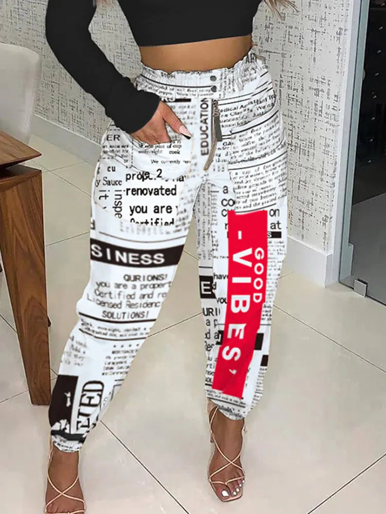
Newspaper print is a pattern made from things we are used to reading. Large letters, small columns and contrasting blocks all compete for attention. That makes the most useful styling decision surprisingly simple: decide how much more information you want beside it.
Annie's High Waist baggie fashion pants are our reference. The photographed version combines black lettering on a pale ground with a red rectangular accent. The pictures show how a plain black top leaves that graphic mix easy to see. You can use the same starting point without copying the entire outfit.
Let the print be the lettering
Choose a plain tee, shirt or knit for the first combination. A second slogan or large logo gives the eye another piece of text to read. If you want the trousers to lead, let their lettering be the only lettering in the outfit.
Black creates a firm frame around the pale print. An ivory top creates a softer transition. Hold both beside the trousers before putting the outfit on; that quick comparison reveals whether you prefer contrast or continuity. Save a brighter top for a separate experiment.
Decide what to do with the red
The red block in the pictured version can remain a single accent. You do not need to repeat it. With a black top and dark shoes, it already interrupts the black-and-white pattern and gives the outfit a clear point of difference.
To connect it elsewhere, try one small red item from your wardrobe, such as a compact bag. Keep the other accessories simple and compare the outfit with and without that addition. Repeating the red should make the combination clearer to you, not create an obligation to match every detail.
Give the pattern a plain frame
An open solid-colored jacket can create two clean vertical edges around the print. Start with a jacket you already wear and look at how much of the waistband and upper pattern remains visible. A shorter jacket reveals more print; a longer one can contain it within a narrower area.
Keep the jacket's surface quiet for this first version. Heavy decoration, contrast stitching and another large pattern all add different kinds of information. You can introduce them later if that is the direction you enjoy.
Read the outfit from a distance
Step back from the mirror and notice what reaches your eye first: the red block, the dark top or the lettering. Then look close up. A busy print can feel different at those two distances, so judge the complete outfit instead of one isolated detail.
Finish with a shoe chosen for your plans and keep the rest of the look as simple as you like. The typography already supplies character.
See Annie's High Waist baggie fashion pants and compare the current variants and measurements. The photographs here refer to the shown print version.